Hi Goddesses

And welcome to an exciting new series on The Crumpet - Crumpet's Choice. It basically gives me any and every excuse to walk you through my stash, my preferences, my polish loves and anything else that tickles my fancy.
We start with the awesomeness that is Barry and his M. Originally, this post was going to draw from ALL his polishes, but as we have 5 new Gellies on the way, I thought I'd split it. So today focuses on the cremes, the Nail Paints.

Barry M has many gorgeous colours, and many of his most popular shades - eg the Ice Creams - are not amongst my personal favourites. What I have here though are the 7 I use the most, that I feel are the most unusual or to die for or unique, or that just provide a very specific balance to your collection. If you're lucky enough to have 60 seconds to scoop up 7 Barry M polishes, these are the ones I'm suggesting you choose.

We start with Block Orange. This is my most used Barry M. It's just THE perfect orange, and it's also super glossy. Worse, it started my orange obsession. I never loved an orange until this polish, and I haven't found another orange since that's as pure or as perfect.


(YIKES! super nubs!)
Next, Indigo. This is just a stunning shade. When I bought it, it was quite unique in the polish world, but lots of other brands have since attempted something similar - Miss Emo Shun All by Sation being the closest dupe. This polish is just soooooo dramatic and deep and intense. It's amazing, and again, I have no other purple that compares to it.


I think this next choice will surprise you - Lime Green. We all know I am a hater of greens, and my skin particularly abhors warm greens, so how the hell does this make the cut? Well, it's just so ugly that it's gorgeous. It transfixes me ha ha. I literally can't stop staring when I wear this one. Admittedly, this colour is less unique in polish world, and it's also one of the thinnest Barry M polishes I've encountered - I usually need 3 coats for opacity - but I guess that also means it's one of the few Barry M's that will provide you with a jelly sammich.


(are those REALLY my nails???!!! ugh!)
Shocking Pink. To be fair, it's not that shocking, it could stand being dialled up a couple of notches, but this is a perfect pink. For me, it just sits in the centre of the pink spectrum - not too blue, not too red; not too light, not too dark; not too white based, not too corally. It's poised on the axis of perfection, and that's why I use it a lot.


And then we have 3 blues. I always considered Barry M one of the best brands for blues - and blue probably appeared more times in his range than any other - but recently other brands have overtaken him here, namely KIKO.

Blue Moon however, is essential. This is a super soft, super light baby blue with the teensiest bit of shimmer, and for a long time, it was unique in my stash. Other brands are now catching up with it, but at a higher price. This is probably my all time Number 2 Barry pick.


Next we have Blueberry Ice Cream, which is just lu-uh-ush. This is probably the only ice cream shade I genuinely love, as (for me) the other colours can be a bit sickly. This is just blue perfection. It's also almost opaque in one coat. I use this a lot as it's the perfect colour for the sky in nail art. Just delicious.


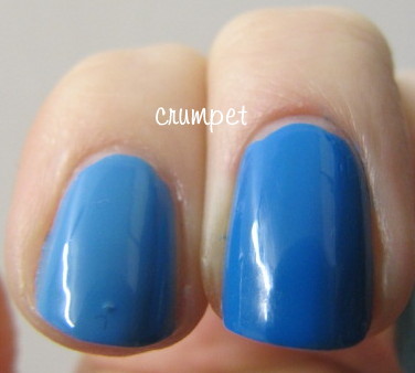
And then we have Cyan Blue. When I bought this, again, it was unique, and I think it may still be. It's not quite turquoise, and it does lean darker than the bottle, but there are literally a million variations in this little niche of the blue spectrum. Again, this is effortless application. If you want a nice bright, summery blue, this is your polish.


And that's it, your 60 seconds is over! Which was your favourite? There are LOTS of Barry M swatches on this blog (just use the search box), and you can also click the logo in my sidebar to go directly to their website.
You can also click on this post HERE to see pics of my Barry stash. It's grown a bit since then, but it's got some pretty photos :)
Barry M have a really good price point, which is part of their appeal in the UK. More importantly, they LAST. They are more chip-resistant than most brands, and I'd say that was more valuable.
In the US, you can pick them up at Ninja Polish.
Enjoy xx :)

Barry M has many gorgeous colours, and many of his most popular shades - eg the Ice Creams - are not amongst my personal favourites. What I have here though are the 7 I use the most, that I feel are the most unusual or to die for or unique, or that just provide a very specific balance to your collection. If you're lucky enough to have 60 seconds to scoop up 7 Barry M polishes, these are the ones I'm suggesting you choose.

We start with Block Orange. This is my most used Barry M. It's just THE perfect orange, and it's also super glossy. Worse, it started my orange obsession. I never loved an orange until this polish, and I haven't found another orange since that's as pure or as perfect.
(YIKES! super nubs!)
Next, Indigo. This is just a stunning shade. When I bought it, it was quite unique in the polish world, but lots of other brands have since attempted something similar - Miss Emo Shun All by Sation being the closest dupe. This polish is just soooooo dramatic and deep and intense. It's amazing, and again, I have no other purple that compares to it.


I think this next choice will surprise you - Lime Green. We all know I am a hater of greens, and my skin particularly abhors warm greens, so how the hell does this make the cut? Well, it's just so ugly that it's gorgeous. It transfixes me ha ha. I literally can't stop staring when I wear this one. Admittedly, this colour is less unique in polish world, and it's also one of the thinnest Barry M polishes I've encountered - I usually need 3 coats for opacity - but I guess that also means it's one of the few Barry M's that will provide you with a jelly sammich.
(are those REALLY my nails???!!! ugh!)
Shocking Pink. To be fair, it's not that shocking, it could stand being dialled up a couple of notches, but this is a perfect pink. For me, it just sits in the centre of the pink spectrum - not too blue, not too red; not too light, not too dark; not too white based, not too corally. It's poised on the axis of perfection, and that's why I use it a lot.
And then we have 3 blues. I always considered Barry M one of the best brands for blues - and blue probably appeared more times in his range than any other - but recently other brands have overtaken him here, namely KIKO.

Blue Moon however, is essential. This is a super soft, super light baby blue with the teensiest bit of shimmer, and for a long time, it was unique in my stash. Other brands are now catching up with it, but at a higher price. This is probably my all time Number 2 Barry pick.

Next we have Blueberry Ice Cream, which is just lu-uh-ush. This is probably the only ice cream shade I genuinely love, as (for me) the other colours can be a bit sickly. This is just blue perfection. It's also almost opaque in one coat. I use this a lot as it's the perfect colour for the sky in nail art. Just delicious.
And then we have Cyan Blue. When I bought this, again, it was unique, and I think it may still be. It's not quite turquoise, and it does lean darker than the bottle, but there are literally a million variations in this little niche of the blue spectrum. Again, this is effortless application. If you want a nice bright, summery blue, this is your polish.


And that's it, your 60 seconds is over! Which was your favourite? There are LOTS of Barry M swatches on this blog (just use the search box), and you can also click the logo in my sidebar to go directly to their website.
You can also click on this post HERE to see pics of my Barry stash. It's grown a bit since then, but it's got some pretty photos :)
Barry M have a really good price point, which is part of their appeal in the UK. More importantly, they LAST. They are more chip-resistant than most brands, and I'd say that was more valuable.
In the US, you can pick them up at Ninja Polish.
Enjoy xx :)