Tuesday, 31 July 2012

Olympic Outfits

Hi Goddesses


Technically, today is Day 43 of the Summer Challenge (2/3 through, 2/3 through ... we can do it!!) and it should have been Olympic Medals.  However, to say mine sucked ass like a highly priced whore is an understatement; it was embarrassing lol, so instead I have for you a replacement mani.


This is my homage to the outfits the British team wore as they entered the stadium on Friday night during the Opening Ceremony.  White tracksuits with gold embellishments, it's had a LOT of stick in the press, but I thought there was something of the Modern Olympian to it, and I liked that it harked back to Greek beginnings.  I also like that I got to use hark in a blog post!!!


So, this is 3 layers of piCture pOlish White Wedding which I also blogged yesterday as part of their Blog Fest.  It's a white milky jelly, which takes time to build up, but it's laced with the most amazing pastel rainbow shimmer.  IF you have sunshine of course .....


I used good old Barry and his M and his gold foil for the embellishments, echoing the gold collars, the strips and the  patches on the outfits.


Simples.  Enjoy :) xx

Indie Week - Dollish Polish Hip Hop Hippity Hop

Hi Goddesses


There are many tough lessons that a polishaholic must learn in life - clean up is ALWAYS a good idea, base coat it and top coat it, Zoya Remove, and perhaps the saddest of all - just because it's a lovely polish, doesn't mean it's going to look lovely on you ....


I learnt this lesson a long time ago, but foolishly, like an old  Southern Belle convinced she has one last raunchy summer left in her, I keep chancing my arm in the hope I might be wrong.  Yeh, never am.   Generally, in life, I can't do pastels.  I am pale skinned, and they wash me out.  I can't wear white tops, I despise peach and lemon with a passion that could wither armies, I avoid pukey pastel pink, and if I'm very lucky, I get away with pale blue and mint green.  Oh, and lilac.  But purple trumps pastel, so that one's ok.


Et voila la Hip Hop Hippity Hop de Dollish Polish.   A gorgeous, gorgeous pale pink, loaded with ice blue and warm pink micro glitter, creamy, dreamy and fit for a Queenie .... but not alas, for a Crumpet.   No.  On me it looks the shade of some vile poodle.  Cruel, terribly cruel.


So this is a post of 2 halves - join me while we lament the fact that I have had to swap away the genius that is Dollish Polish Expecto Patronum, that I can never buy Pretty and Polished Jaw Breaker, that every other sugar sandwich polish is a distant and forlorn dream .......


..... and then rejoice if you yourself can wear pastels.  If you can, you'll want this one.  It's pretty and girly, yet subtle.   It's a floaty, ethereal kind of polish, made for spring and summer breezes and fragrant moments ....


Unless you're a Crumpet :(    Enjoy xx :)

Monday, 30 July 2012

Indie Week - Red Carpet Lacquers Professor Plum

Hi Goddesses


Indie Week is back :)  wow, it feels like it never really went away!  Perhaps it never will as I seem to keep accidentally buying polishes :)


Today's polish is from the lovely Jaime from Red Carpet Lacquers, a lady who takes a great deal of time in crafting her product.  Professor Plum is from her Cluedo Collection - a true geeky theme :)


Professor Plum is an interesting polish, and (and I mean this in the nicest possible way) looks nicer the further away it is :)


Up close, it's one of those super gritty new polishes which is basically a kilogram of microglitter squeezed into a teaspoon of base.  This means it takes 3 coats for opacity, can look a bit threadbare around the edges, and doesn't always spread quite the way you want it to.


This type of polish is my current Nemesis.  No matter how hard I try, I either have to accept I won't get 100% coverage (maybe only 98%) or try and get it in all the corners and then ensure clean up hell.  No matter how hard you try, there's always some gluey bugger that won't come off!  If ANYONE has any tips on how to clean up this gritty stuff, I would be soooooo grateful :)


It's an arresting colour combo though,  browned off purple and red, and they clash and match perfectly.   And this is what I mean about from a distance - the further away your hand is, the more those colours meld and collide, echo and merge.  The grittiness gets lost in a blur of purple that fizzes with light, and is really, really quite beautiful.


Red Carpet Lacquers is also the maker of one of my favourite polishes of all time, Oz, Not Kansas.  If you haven't checked her out yet, you can stalk her here on Etsy or here on Facebook.


Enjoy xx :)

Olympic Opening Ceremony Nails

Hi Goddesses


Well, how was it for you ?    I have to say, I thought it was spectacular, but I think that is because I am British.  Put it this way - I've found pretty much every other Opening Ceremony boring, but this one made me very proud.


Firstly, let's take a moment to applaud the audaciousness of Danny Boyle, and give whoever chose him a pat on the back.  He's an insanely talented film director, always on the edge, so that made him a very unexpected choice for this project.  But I thought he put it all together with precision, power and eloquence.


On to my highlights, then.  I haven't managed to capture everything, and to be honest, I think I could do a whole other mani with my other favourite bits that aren't here - Mr Bean, music, Bond, her Maj picking her nails in a semi-coma - but for now, I've picked my most iconic moments.


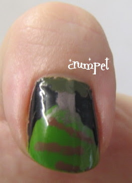
The thumb depicts the hill that dominated the ceremony, the heart of our green and pastured land.  Who could have predicted that the Ceremony would start with a village of grass lol ?   Absolutely awesome, and I loved how it retained it's icon imagery right to the very end, when it was planted with the flags of the world.


The index finger is the Olympic rings which were forged from molten iron, and rose into the sky, to settle there, like burning clouds amidst a shower of fireworks.  Did anyone else think it was a very LOTR image, especially when the tree on the hill was ripped up to make way for industry?   I thought the making of these rings was just spectacular.


My middle finger is abstract, and also possibly my favourite part of the ceremony.   I generally can't stand songs like Abide With Me, but on Friday night, in the breathless and angelic hush of Emeli Sande, it was poetic, perfect and profoundly moving.    The song accompanied a balletic dance which started with the yellow-orange hues of winning the bid in Singapore, and then represented the bloodshed of 7/7, and was entrancingly enacted by a troupe of burgundy clad dancers.  Initally, I am sure they started in heart formation, hence the design on my finger.   Tears ?  Definitely.  Exquisitely moving.


The ring finger is the chimney - the symbol of the Victorian age which transformed England into the hub of the empire and the darling of the Industrial Age.  I also loved Sir Kenneth Branagh, and thought the choice of text from The Tempest was perfect - both in choice and delivery.


And finally ... well, it was all about the flame, wasn't it.  I am so glad it involved Sir Steve Redgrave, but how moving, that eventually it was entrusted to the new generation.   And what about that cauldron ?   A gorgeous spiral of copper kettles, lying flat it looked exquisite enough, but once it rose into the sky - wow oh wow oh wow.   Stunningly beautiful, and I hope it can be retained after the Games as a symbol of dreams, endeavour and artistry.


So, I loved it.  The Queen, not so much.  She was sat there with her typical frown, picking her nails at one point, and thus immediately losing the credit she gained for being part of the Bond stunt.   Beth laughed hardest at Mr Bean, but who wouldn't ?


There is something special about the Olympics and its symbolism, about the fact that Syria is welcomed as warmly as other countries, and that everyone has spent their entire life in training for this "One Moment In Time" - thanks Whitney.   Somehow, we become drawn in and transfixed by sports that would not even snag our attention at any other moment.  Mostly, I like the stories, and the tears.  I am a big softie, and sporting triumph is one of the things that consistently turns me to mush, from Sir Steve Redgrave and Mathew Pinsent hugging each other in victory; to Derek Redmond, in the shape of his life, broken and in tears, leaning on his father to finish the nightmare lap that his dream had degenerated into; from the modesty of Jonathan Edwards, to the big boy bravado of the sprinters - man, I love it all.


See you at the Closing Ceremony :)  Enjoy xx


piCture pOlish Blog Fest 2012

Hi Goddesses


Today is a VERY special day.  Today is Picture Polish BlogFest Day, where a number of bloggers - including me, squeal! - have been chosen to showcase their new Collaboration Collection.


Those of you who know me will know how excited I am about this.  Picture Polish are genuinely one of my favourite brands (and the mummies of Ozotics) and the fact that I also had to keep it a secret only added to the thrills!!!   


So, imagine the excitement.  You've been picked, the email tells you the polishes are on their way, the envelope arrives ..... and you STILL don't know what's going to be inside!  Oh, it truly was like Christmas Day.   Both of my polishes are from the new Collaboration Collection, and whilst neither are the first colours I would normally put in my basket, they are both very special in their own ways.


And then my index finger split.  Again.  But, and here's the really "funny" part, for the first time in MONTHS, and yes, on the eve of the day I had to do my most important swatch ever.  Oh yes, someone's laughing.   So here they are, these glorious polishes, on my uber-nubs :(   Really, it's ok, these are tears of joy, of joy .....


First up we have Kryptonite, which was created with the amazing Cathy from More Nail Polish, and one of my favourite bloggers / enablers.   Kryptonite is a dark green moss, infused with holographic particles, which look like embedded sugar on the nail.


This one has a very spectral look for me.  I love it when the holo ADDS something to a polish, and with this it does - there's a layer of electricity just bubbling away under the surface.  In some lights, this also reminds me of The Matrix - the dark computer screen with the ghostly green lettering cascading down.


The overall combination is quite delicious.   Tonally, this reminds me a lot of CG Glittering Garland - it's got that same dark, DARK Christmassy vibe to it.   It's also got a lot of enchanted forestness about it too.   But a dark and twisted enchanted forest, oh yes.


And then SHOCK HORROR the sun came out!  And woah ..... suddenly all the little pixie dust woke up and turned this into an emerald version of Dorothy's slippers.  Super sparkly, super precious, super dazzling.


White Wedding is the total opposite.  This was created with a lady most of us know, and who has changed the landscape of polish purchasing in the last year - Leah Ann LaRowe.    Leah Ann's store - Llarowe - was the first place I saw piCture pOlish and Ozotics, so I love that she has been honoured in this Collection.


White Wedding is a bright off-white shimmer, loaded with dazzle which shines predominantly gold.  In the right light (piCture pOlish, why you send this to gloomy England lol) you can see a whole rainbow glimmering subtly.  I'm sure this looks amazing in countries that have a summer! This was 3 generous coats.


Mostly this reminds me of freshly fallen snow.  It's deep, it's lush and it has that magical sparkle effect that snow has.  I like that it's there, but only if you look.  And trust me, it IS there, but between our rotten weather and .... more rotten weather, it just wasn't going to happen in these photos - sorry!


This is also prefect for brides - it represents the purity of the union, with just that little bit of glitter for the polish lover who can't let go lol.


Now, as you all know, I'm not really a white girl.  It just doesn't match my skin tone, so this isn't one I would ever buy in real life.  However, being someone who appreciates the purity of white as a base for great patterns, I imagine this will add a subtle element to some manis - I wonder if the sparkle will still show through once I put some dots or stripes on top of it?  (Clue: we'll find out soon).


Now, my 2 polishes are available to order from piCture pOlish online here, and their network members here, along with the other polishes being released today.  I find it ironic that as the renowned purple whore, I didn't get sent either of the purples lol, and by the way, they look AMAZEBALLS!  This is definitely the best Collection piCture pOlish have ever done.


 Everybody who's posting today is doing it under the banner of piCture pOlish Blog Fest 2012, and of course there's the piCture pOlish website here and their Facebook page here.


Finally, these polishes were sent to me for review, I wasn't paid for my comments, and what I have written is my honest opinion.  Now, if you'll excuse me, I think I have some PP shopping to do !!  Squeal!


Enjoy xx :)

Related Posts Plugin for WordPress, Blogger...
Blogging tips