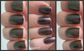
ZOYA - Ki
Hi
Goddesses
Oh dear, I am a tardy Crumpet. I have had this in my “to do” folder for so
long, you can probably see the posters in the background advertising Betamax
video recorders!
No, it’s not that long, probably 4 weeks, but
I made the classic mistake of taking this polish off before I wrote the post,
and if there’s one type of polish you cannot do that with it would be ….yes, a
duochrome.
So, I have today reswatched my thumb so that
I could find some accurate words for you.
Ki is very unusual in Zoya’s cannon, as they usually prefer sensational
crèmes. I am sure a lot of you will also
look at this and wonder how it compares to OPI’s Not Like The Movies, well
don’t worry, I’ll answer that question for you too.
In the bottle, this is an amazing and
indefinable swirl: green, purple, petrol – it’s all very nebulous and
intertwined. On the nail, you still get
this “what is it” effect, but in a different way.
Depending on the light, you either see dirty
grey, shimmery mauve or pigeon green.
All of the colours look as if they have been born in a sewer – this is a
really grubby looking colour, but I do think this adds to its mystery. Best of all, in some lights, this totally
goes dark and rogue, like pure purple grape skin.
The duochrome effect on this is really good,
and you can see bend on the colour in most positions. This is a greyed out version of the tipping
point where olive meets aubergine – and it’s quite a beautiful tipping point.
Side by side, this has a lot of similarities
with OPI’s Not Like The Movies, although the OPI is a couple of shades lighter
– more of a steely grey than a dirty grey.
They both bend in the same spectrum (purple-green) with NLTM coming out
a few shades lighter. This is 2 coats of
Ki v 3 coats of NLTM.
NLTM also has some secret hidden sparkles in
it, which adds to its more ethereal feel.
For the record, Zoya also do another
duochrome, Adina, which sits between the 2 of these. Again, it’s on a purple-green axis – not as
dark as Ki, but not as pale as NLTM.
It’s perfectly lovely, but when I got it I decided I didn’t need 3 that
were so similar – let’s face it, even having 2 so similar is pushing it lol.
Enjoy J xx
J
Top Tip – if you’re
ever unsure what a nail colour looks like, go to Google images, which will give
you plenty of contrasts and compares.


